Sunday, May 5, 2013

Martha Stewart Crafts: Outdated, but Addicting Anyway.


So, I’m addicted to watching videos from Martha StewartCrafts’ Youtube page. And I feel bad, because honestly, it's kind of a crappy channel. 

Things I do like about Martha Stewart:
  1. Glitter—Seriously somebody over there is like obsessed with making every color of the rainbow happen in glitter. Martha Stewart Crafts is the Crayola of glitter.
  2. Scoring Board. That thing is about a thousand times more useful than the Scoring Buddy I used to see on Youtube all the time with scoring grooves consistently across the whole board, instead of intermittently.
  3. Paper Punches—they may be crazy bulky, but they’re still cool.
  4. The fact that she has a product for everything. It’s a little crazy. But in some areas, she does take it too far. See number 2 in the list below.
  5. All of the product is branded really well and really distinctively. Which makes it fun to look at!

But seriously, Martha, get with the program.

Here’s what Martha needs to change about her Crafting division:
  1. Make videos that don’t look and sound as if they were made in the 80s. Seriously.  Can you believe they posted this video just last year? And the music they use reminds me of my favorite British TV show from 10 years ago, about 2 gardening detectives in their 60s. (Okay, the music in the last couple ha been better. But still. Not a lot better. Just let people talk!)
  2. Quit making weird products that anybody with half a brain realizes is wasteful. And weird. Like the glitter-clean-up-roller. Like the top comment in the youtube video says, I use glitter over a piece of paper, so I can reuse as much glitter as possible. 
  3. Let the people promoting her products in videos sound a little more excited and spontaneous. The people talking in her videos are following the world’s most bland script. Ever.
  4. Make videos of people creating products, not all how-to videos. Seriously Martha, check out Hero Art’s Youtube page. 
  5. And make more videos in general. 41 videos over 5 years is so not enough! Hero Arts has over 300!

And yet, despite my complaints, and the videos that are (SLOWLY) getting better (check out the videos from 2009 to get a blast from the past), I still enjoy drooling over Martha’s stuff. Why? Because I’m addicted to crafting products. And they look pretty. And I really am surprised every time they come out with another kinda-weird-kinda-useful product! But mostly, it’s because I’m addicted to well-designed crafting product, even if it’s mildly unreliable, like the Simple Circle Cutter.

Friday, May 3, 2013

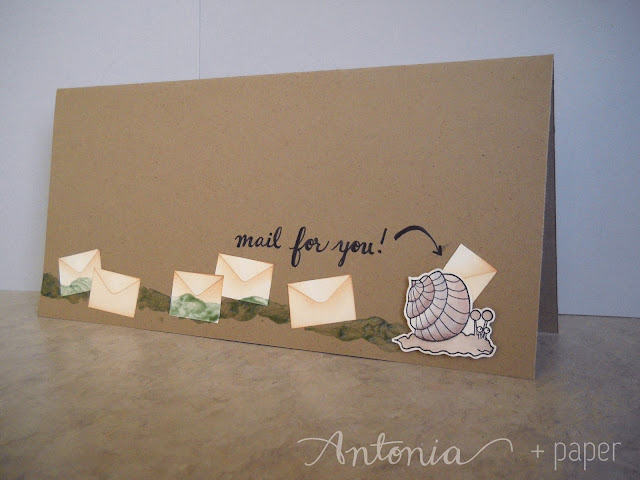
(Snail) Mail for you! Card

Today's card started off with the main embellishment. I have to listen to a lot of radio shows for a class I'm in, and I feel bad if I'm not doing something. So to keep my hands busy, I've started coloring in stamped images. I colored the snail probably about two weeks before I figured out exactly what I wanted to do with it!


So here's the card! I started out with a regular sized card (4 1/4" x 5 1/2") but then realized the vision I had for this card is far bigger! So I did some quick internet searching of what the size is for a standard business envelope (4 1/8" x 9 1/2"). I subtracted a quarter of an inch off of the dimensions to get a card that would slide in and out of the envelope easily at 3 7/8" x 9 1/4".


Speaking of envelopes, I thought it would be a super cute card if the snail looked like it was delivering envelopes! So I cut out all of these envelopes by hand, and inked them with my Inkssentials Ink Blending Tool to make the envelope flap stand out. And I glued them all onto the card! I stuck the snail on with some Foam Adhesive.

 Then I thought, what about a snail trail? Wouldn't that be the coolest thing? But how to make it shiny? Luckily I have some chalk pastels and glossy Mod Podge hanging around! I picked a light green and a brown chalk and created some muddy brown dust by scribbling it in a concentrated area. (This is the set I used. I used the green and the dark brown that are in the first column in the picture.) Then I used a brush (I have a set similar to this one) to mix the dust into a quarter-sized dollop of glossy Mod Podge. (It has to be the glossy kind--not matte!) After doing some tests to make sure it worked, I used a brush to create an uneven snail trail across the card.


 Doesn't that slime look awesome?!


Here's a close-up of the snail! I colored it using Bienfang Watercolor Brush with the clear and the brown brush in the set. I also used some purple from the Colorbox Fluid Chalk Ink in Wisteria to add an accent shadow on the shell. I think I used the lightest brown from the Martha Stewart Watercolor Markers to shade in the body of the snail. All of the ink were applied with the water-only brush from the Bienfang set from a reservoir I created by scribbling or stamping on my Kraft Mat. This keeps the colors from getting too intense and lets me have more control.


Then I thought it was a little boring, so I decided to add in a sentiment. I thought not actually saying "snail mail" would be kind of fun, making it something for the receiver of the card to puzzle out. So I just wrote "mail for you!" with my Pilot BeGreen Precise V5 black pen.

And that's the entire card!

BASIC INSTRUCTIONS

1. Color the snail. Cut it out.

2. Create 7 envelopes by cutting out small rectangles, and small rectangles with a curved point. Accent by adding the shadow with the Inkssentials Ink Blending Tool and Distress Ink in Tea Dye.  Glue the pieces together with a liquid glue.

2. Adhere the envelopes with an adhesive runner.

3. Add the snail on with a foam tape.

4. Mix colored chalk dust with glossy Mod Podge. Apply with a brush.

5. Write in the sentiment.

MATERIALS

Adhesives:

Stamp:

Coloring Tools:

Embellishment:

Tools:
Brushes (something like this)

Paper:

Standard Tools:
Bone Folder-- something like this one

Thursday, May 2, 2013

You Make Me Feel Existentially Dizzy Card

So, I'm pretty excited about this card! I came up with this (minorly sentimental, majorly off-kilter) sentiment when I was walking in the rain a few weeks ago, actually. I love thunderstorms, and I was trying to come up with something that described my exhilaration. And then a few days ago, an idea for a card popped into my head! Ta-Da! Low on products, high on impact, what is up?! 


 I used a stipple brush, something like this to put the paint on, and now looking back at the picture, I see you can really tell near the bottom of the circle where the paint pattern gets a little repetitive, as if I had used the clone tool in photoshop really poorly.  Gah, note to self: turn the stipple brush, Antonia, turn it!


Anyway, I started out with a basic card base, and just started stippling blue and black acrylic paint onto the card directly. It bowed out a little so I heated it with my heat gun.


You can really see the effect the stippling motion has on the paint here: it brings a sort of rough texture to the card, which I really liked the look of.

I just put some paint on a post-it (for easy clean up) and mixed light blue and black together to create a deep blue and put that on the card in a rough circle. After I filled the circling in with a straight up and down stippling motion, I added some black paint without mixing to give the paint a varied sort of sky-gradient. I just love how it turned out!


Then I hand-lettered the sentiment, taking care to keep everything centered, while embracing a sort of free-er look by not drawing any guidelines ahead of time! I also made a mistake, which you can see in the picture above a little. I accidentally wrote "YOU" instead of "MAKE," but I wiped it off with a baby wipe before it got too dry.

Then, once the letters were dried, I added in stars and dots. Done.

SUPPLIES
Stipple Brush
Black Acrylic Paint
Light Blue Folk Art Acrylic Paint
Gold Sakura Gelly Roll Pen
White Sakura Gelly Roll Pen
Recollections Value Pack Cardstock Paper in Kraft 

Heat Gun

Wednesday, May 1, 2013

(Explicit) Third Badass Card

So this is the last card in my series of 3 badass cards. This is the fastest, and, I think, has the coolest lettering.


I wanted to do this rather explicit card mostly because I thought it'd be fun! Like the concept of "badass" cards that I've been running with the last several days, this card promotes a sense of irreverence, for that best friend who really is totally BA. And I also wanted to write this out because there is a certain grandeur about cursing. It's rare to see it just one the shelves of your Hallmark card section (although can you blame Hallmark? Overprotective mothers would throw a fit!) But I definitely think there is something about saying these phrases that are rather taboo (and yet aren't hurting anyone, especially in this context.) It feels freeing, and therefore recursively self-reinforcing of the message. What I'm saying is, you feel like a badass, just saying the word badass because it's taboo. Doubly so for motherfucking badass.

Also, I think this is a good sentiment because it's a tiny bit vague and therefore the intent of the card can be whatever it needs to be: just saying hi, a congrats card, a happy birthday card, you name it.


This card is embossed with embossing powder, and melted, giving it that really nice 3D texture. I sketched out the words ahead of time with a mechanical pencil, lightly. Then I traced the pencil with a Zig 2-way Embossing Pen. I had to do it in sections, because otherwise the ink from the embossing pen would dry out and the embossing powder wouldn't stick to it. (I wrote out, "motherfucking" first, covered it in powder, and then wrote out, "badass," and covered it with powder.) Then I hit it with a heat gun, and that's all there is too it.

You can see in the pictures how there is a little bit of embossing powder that stuck to the page. I could have gotten rid of stuff like that by wiping down the page with a powder tool or embossing buddy or something, but on this card especially, I kind of like it. I think it brings a little interest to an otherwise very simple card.

I was saving this for a while, because I couldn't decide if I should try to put something else on the card, but as of yet, nothing's occurred to me, so for the foreseeable future at least, there are no embellishments on the card. I guess that means it'd be a good card to mail, haha!

Since this is such a simple card, expect another card soon, today or tomorrow!

Supplies
Zig 2-way Embossing Pen (I used the purple pen)
Gold Embossing Powder
Recollections Value Pack Cardstock Paper in Kraft 
Heat Gun

Friday, April 26, 2013

Second Badass Card

So, after I made the last card I posted here, (this one), I was still feeling like I hadn't achieved my goal. I was trying to create a card that spoke to me, personally, and would be the kind of thing that my best friend would buy for me...(or vice versa!)

I had the labeling tape out on my desk from the previous card, and suddenly a super simple design occurred to me, a flash of inspiration!


I used my T-square ruler to measure out the center of the card, aligned my Martha Stewart Crafts Circle Cutter to the center of the circle, and instead of cutting a circle, used it to create a perfectly centered circle. Unfortunately, that circle cutter is extremely sensitive to angles, so the circle came out a tiny bit lopsided. So I decided to fix the situation by drawing several circles, so visually it would look like all of the circles were fine, just not exactly centered.

And from there it was a walk in the park. Create labels. Cut at appropriate length. Adhere.


I really really really love how this one turned out. It probably took 3 minutes to make, but it  looks fantastic. Bold, modern, clean and simple. Sooo coool.


And I know this seems like a bizarrely specific and altogether odd card to make. But, I kind of see it as a version of those "Thinking of You" cards or "Sending Love" or "Just Because" cards. I think people ought to give more cards to people on days that aren't Christmas or their birthday, and this seems like the perfect thing to give someone on a Wednesday, just because. 

Also, check it out! I finally have a pen that I didn't take from a Realty agency, so I can link to the actual pen I used!


SUPPLIES

Pilot BeGreen Precise V5 Roll Ball Pen


Thursday, April 25, 2013

You are a BADASS card


So this is totally a salvaged card. You can kind of tell in the lower right corner in the gray, there are some faint lighter squares. This was going to be a modern, simple, stylish card to give to a total badass. That didn’t work out quite so much.
 
On the sentiment: when I made this, I was trying to think of a card that said something that I really wanted to receive. And I came up with this because it's fun, not overly sweet, and still complimentary. 


So I started out writing BAD-ASS out by hand, and using a gold pen to make a neat pattern of squares near the bottom of the card.  Unfortunately I also wrote, “I think you’re a…” near the top of the card and hated it, so I decided to fix it by masking off the center of the card and inking the rest of the card so it would be a medium gray-color.


Then I spent some time trying to figure out some stripes of paper that I liked together here. I inked the striped pattern darker, so it wouldn’t be such a strong visual element. Then I spent time arranging it all (and rearranging it!) Then I added all of the embellishments on top.


I made these leaf embellishments myself with a leaf stamp from Martha Stewart on tan Recollections cardstock and then cut them all out by hand. I popped a few of them up with foam tape to make the bunches more interesting without being overwhelming.


I traced the edge of the gem on the little tag and then cut it out, so I could pop it up on foam tape and still have it hug the gem. Normally I’d just put it behind the gem, but this card has some very interesting dimensional elements and I wanted to continue that theme.


This card and the card I’m posting tomorrow are two variations on badassery. My philosophy is that there are many types of badasses, so it makes sense that there are infinite types of cards for those badasses. Duh. Also this card relieved some of my hunger to make collage cards for a while.


Paper:
Yuletide Joy Paper Pack by the Paper Studio (checked pattern and striped pattern)
Colorbök Paperpad in Cool Earthtones
Artist’s Tape

Inks:

Bling:
Staples
Brown Teardrop Build a Bauble Gem by Prima
Recollections Rhinestone Stickers (Pearl)
Photo Corners made from Dymo Labelling Tape
thrift store gray lace

Glue

Stamp:

Cutting:

Misc:
Typewriter: Xerox 6010 Memorywriter

Wednesday, April 24, 2013

Flip Your Clear Stamps Over

So, it just occurred to me that I could have made that card for my grandmother about a thousand times easier.
This one!
I spent forever masking off part of that long rectangle to avoid a dotted line that was part of the stamp--and I realized today that I should have just flipped that stamp over, or any of my other stamps, and used the back. Duh! Here's a good video by Lisa Spangler explaining this! I wish I had remembered this tip! It's just a little hard to do with non-symmetrical or non-basic stamps, but this would have been perfect here!

Also, new card today! Expect it here soon!